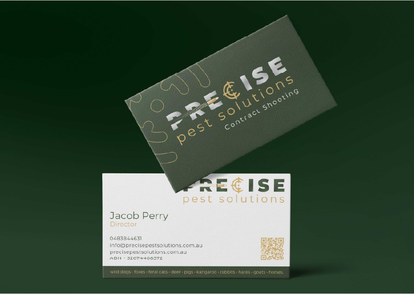
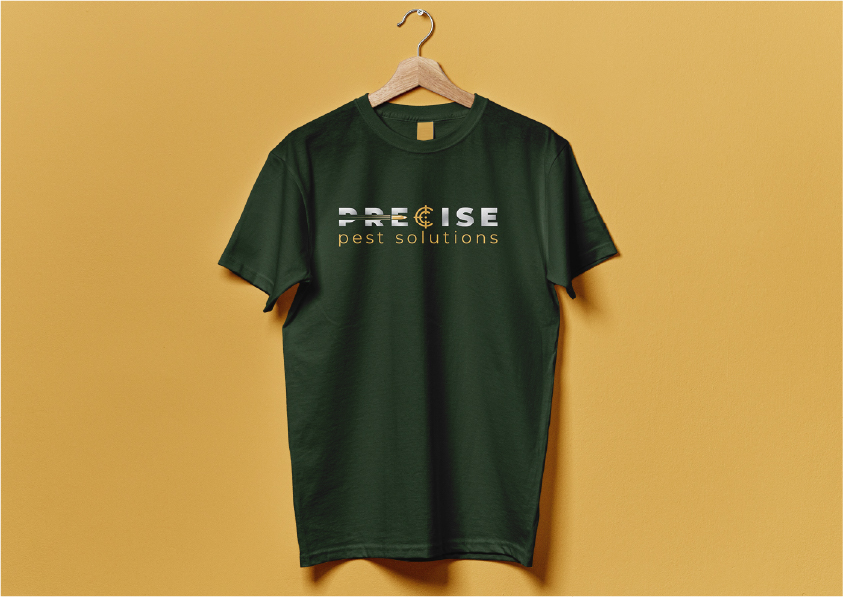
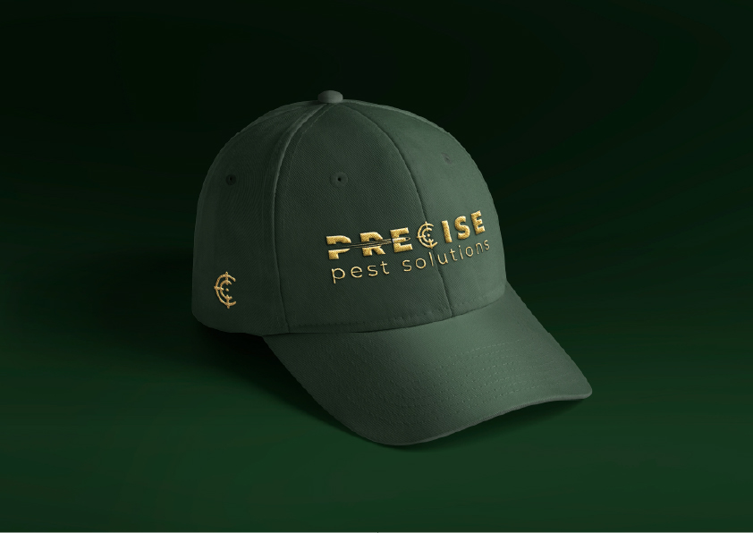
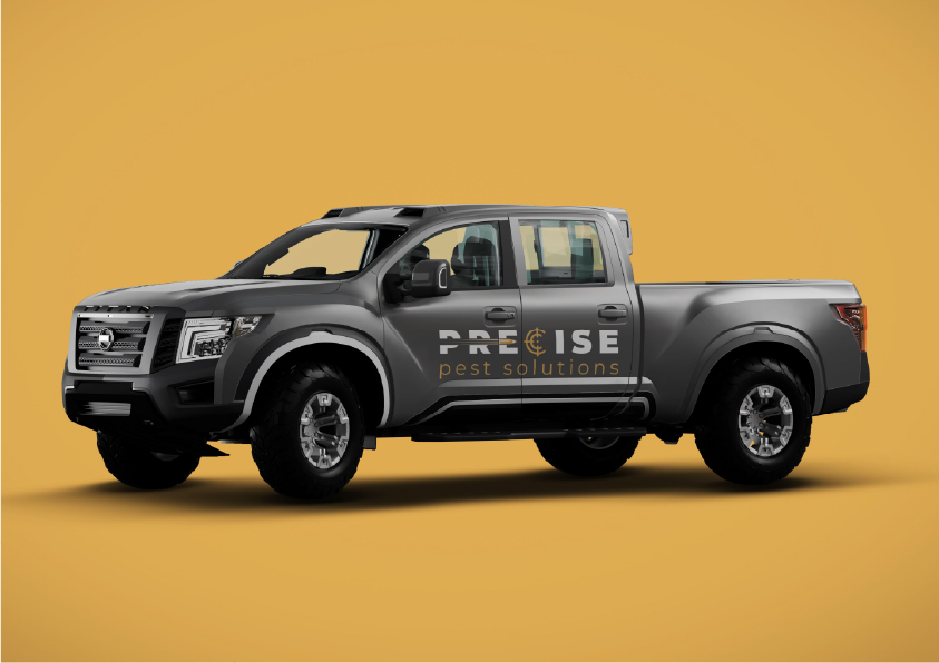
This project involved the development of a complete brand identity system and supporting digital assets for Precise Pest Solutions. The work covered logo design, brand guidelines, colour palette development, typography, iconography, and visual applications across digital and physical touchpoints.
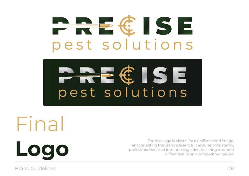
The brand was designed to feel confident, precise, and grounded, with visual cues that reference accuracy and control without relying on clichés. A strong, restrained colour palette was developed using deep greens, dark neutrals, and metallic accents to convey reliability and professionalism. Typography and icon systems were selected to remain clear and legible across vehicles, uniforms, print materials, and digital platforms.
Visual consistency was prioritised across all applications, ensuring the identity could scale from small-format assets through to large vehicle signage and online use.
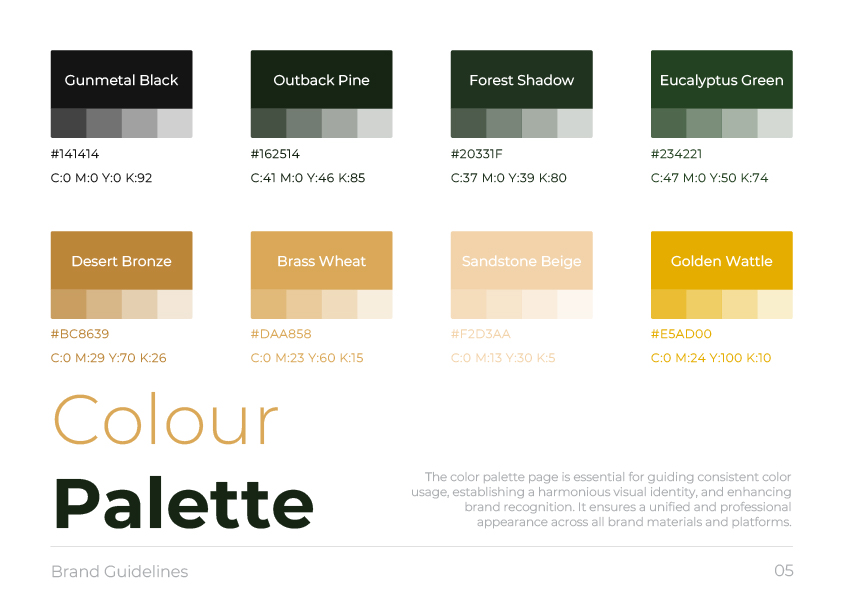
A key challenge was striking the right balance between strength and approachability. The brand needed to feel authoritative and capable while remaining accessible and trustworthy to residential and commercial clients. This was addressed through controlled contrast, disciplined layout systems, and a logo mark that communicates precision without aggression.
Another consideration was durability across real-world use, including uniforms, vehicles, and signage, requiring the identity to remain effective in varied lighting and production conditions.
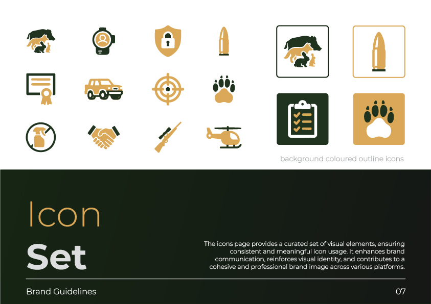
The final result is a cohesive and versatile brand system that feels professional, confident, and purpose-built. The identity translates consistently across digital and physical environments, providing a strong foundation for long-term brand recognition and growth.
