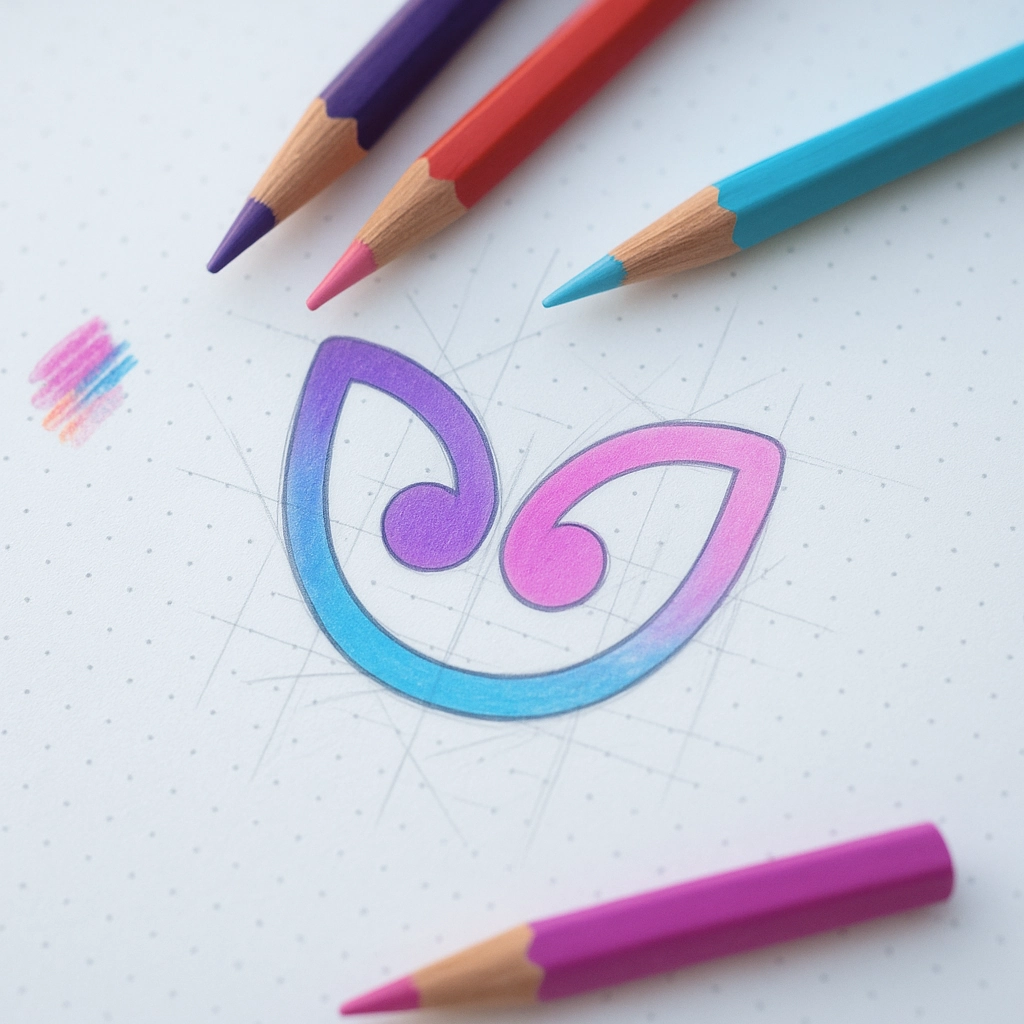
The Psychology of Color
Colours influence emotions and decisions. Blue suggests trust, green reflects growth, red creates urgency, and yellow conveys warmth. Choosing the right palette sets the tone for your brand.
Guiding Attention
Colour directs focus. A bright button or accent colour draws the eye, encouraging users to take action. Contrast helps highlight key information and improve readability.
Consistency Creates Recognition
Using the same colours across your website, social media, and printed materials builds recognition. Over time, people will connect those colours directly with your brand.
Standing Out with Style
The right palette can make you memorable. Whether you choose bold contrasts or calming tones, colour helps you stand out from competitors and reinforce your message.
Practical Choices
For small businesses, colour doesn’t need to be complicated. Start with three or four core colours and use them consistently. This keeps your brand professional and easy to recognise.
Why This Matters
Colour shapes how people feel and act. Done well, it strengthens your brand, attracts the right audience, and influences customer decisions in your favour.

Discover the key design trends shaping 2025. From bold colours and gradients to simple, user-focused layouts, see how to keep your brand modern and fresh.

Discover the top five logo design mistakes and how to avoid them. Keep your brand clear, memorable, and professional across every platform and piece of marketing.

Quick and easy SEO tips for small business websites. Learn how small changes in content, headings, and structure can boost visibility and help attract more customers.